Carrie's January Project Life Spreads

Hello Everybody!  It's that time of the month where I start to work on my Project Life spreads for January!! 

Over the years I've found that since I don't take photos very often I enjoy a monthly format of documenting best.  I tend to take photos of events I want to remember, meals I like, my current favorite mug, etc....you get the picture.  So today I have a couple spreads from the end of January where I showed my daughter Fantasia 2000 for the first time, as well as a bouquet of flowers we put together to remind us of Spring.

Above you can see this first layout has a couple photos from watching Fantasia 2000.  My daughter is laying on the floor in her jammies.  The lady in green is a photo I took with my camera of the TV screen during one of our favorite songs / scenes.  The 6x12 photo is actually a double photo where I took another picture of the TV screen and layered it over a photo of our living room with the bouquet of flowers in the foreground.  I layered them together using Photoshop, and once printed added a thin strip of purple paper to the bottom.  I can't believe how well the product from the Everyday Wishes Kit matched up with the colors of my photos!  In case you didn't know, I'm all about color, color and more color lol!!  This spread was a dream to put together!  Here are more of the details:

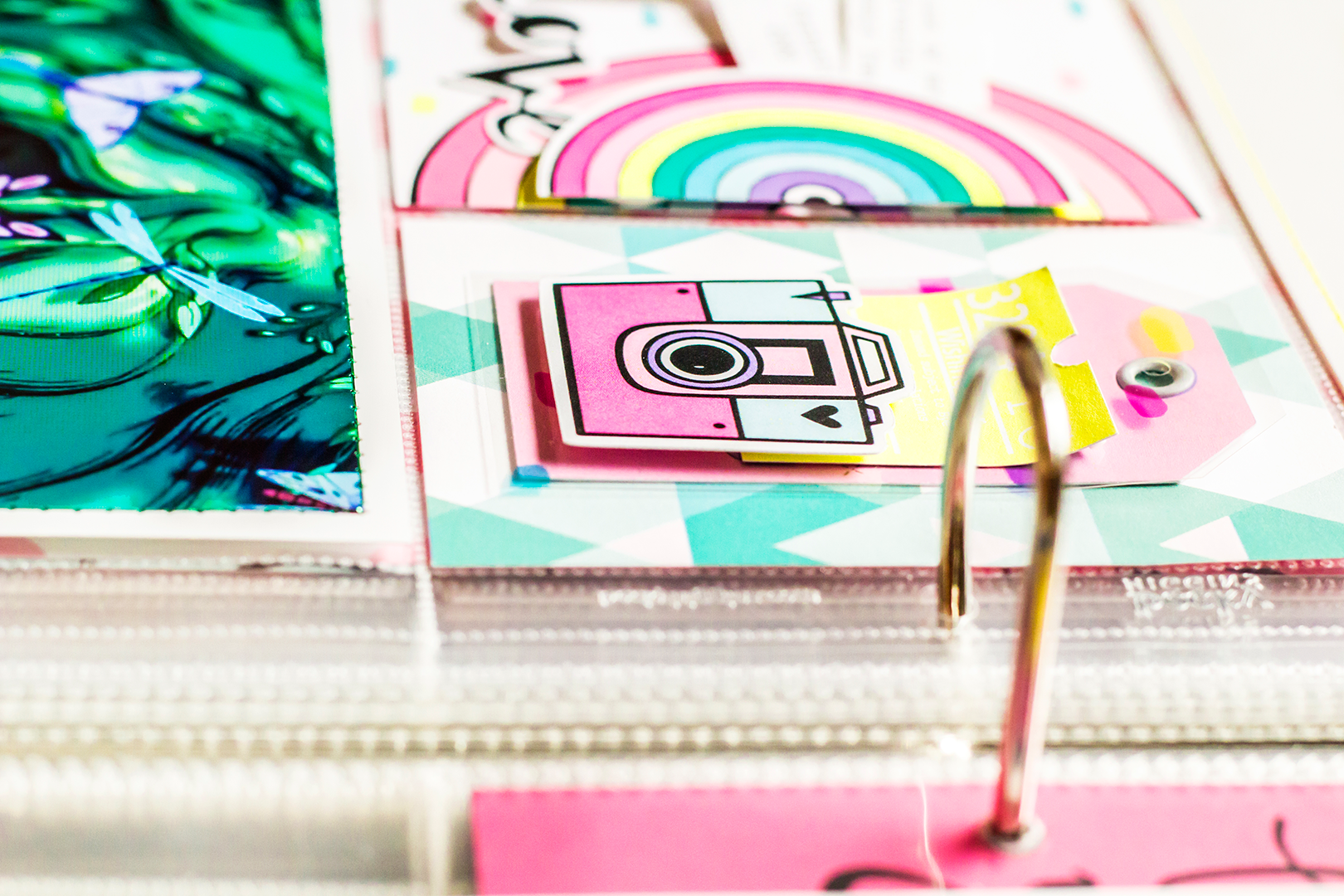
The two 3x4 pockets are filled with lots of layers!  I used a yellow ticket from the cut apart sheet and curled the end up, tucking it under the die cut camera.  The gorgeous transparency is layered under it all while resting on top of a tag from the cut apart sheet.  I added an eyelet to the tag for fun.  Here you can also see a peek at some of the green shimmer stitching around the border of the photo at the bottom.

I used the shimmery green thread for the two photos I took of the TV, and the yellow for the pic with my daughter.  (The pink thread is used on my next spread.)

Adding this extra touch of thread to the borders of my photos made them all pop just a little bit more.  Plus, I love the added texture ; )

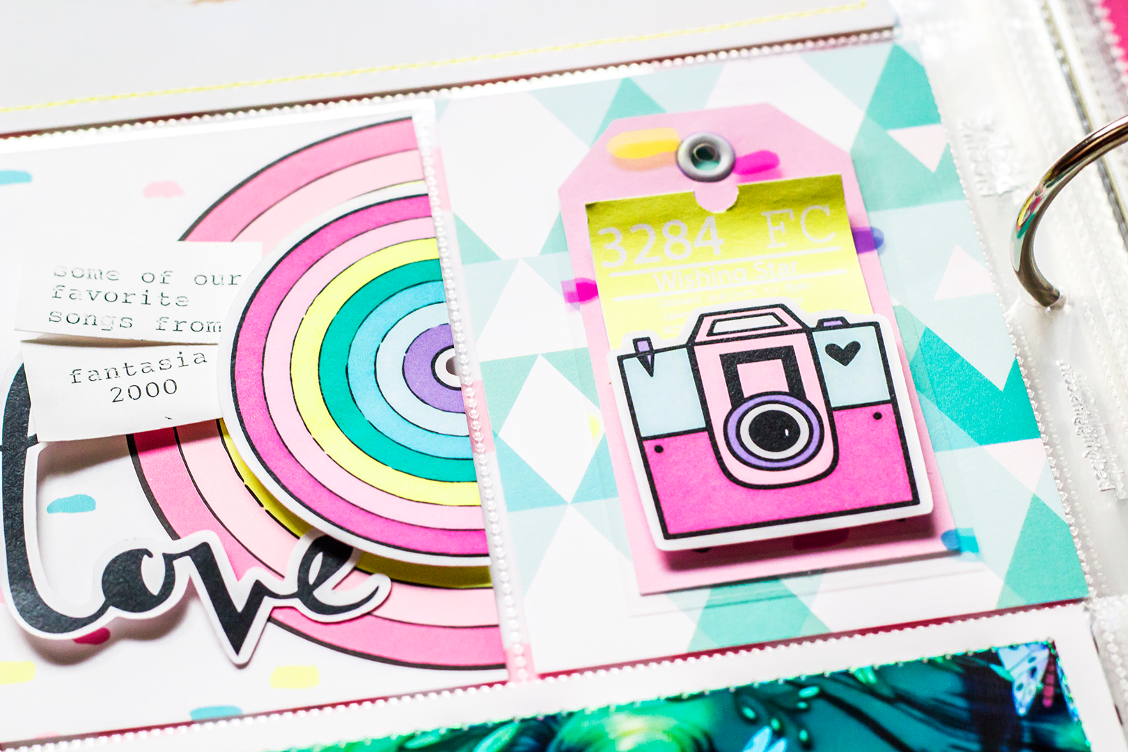
Here's a better look at both 3x4 cards.  I believe the card with the rainbow is cut down from a planner insert.  It is layered with the die-cut rainbow and the script word "love".  The left side of "love" is popped up while the right side isn't.  I did something similar with the yellow tag.  To add just a little journaling, I used my typewriter and some white cardstock.  Most of my journaling for this "event" will be on a spread that comes before this page (which is not yet completed), so I wasn't worried about adding a lot of text here.

And that's it for the first spread!  On to the next!!

This spread is actually next in order in my album!  There is a 6x12 photo of my daughter acting all moody and cute.  We had all woke up with colds this day and I think her face says a lot : )  Across the page I made a tag out of two of the planner inserts adhered back to back.  All I did cut cut the corners at the top and add an eyelet.  Below it is a close up of our flower bouquet.

Here you can see some of the pink thread I used around the border of my photo.

Love the quote Andrea used for this!

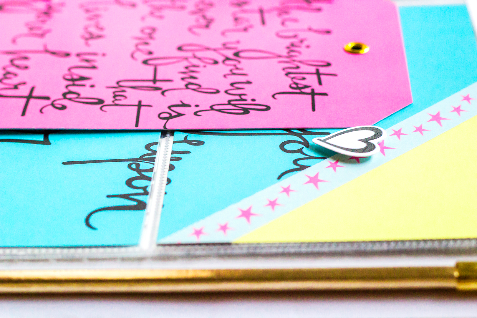
This is what you see when you flip the tag over.  I used a 6x8 planner insert and cut it into a 4x6 and two 3x4 cards.  The piece of paper with the pink stars on blue is part of a border strip that I added in between the yellow and blue of the 4x6 card.  I don't always play the rule of three, but the added pink from the stars makes a triangle of pink across this spread. Plus, it's more stars which goes great with the quote!

I also popped up a die-cut heart between the blue background and star strip.

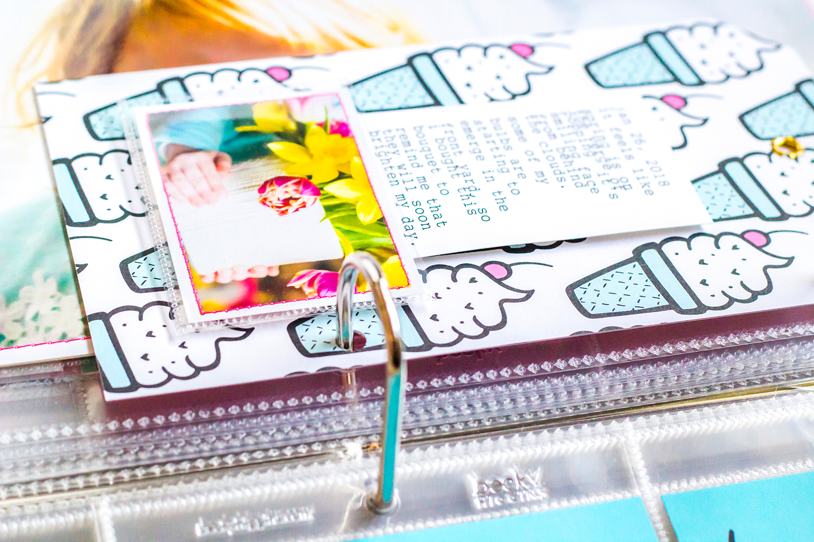
And here's a closer look at the back of the tag.  How cute are those ice cream cones!?!  Anyways, I used my typewriter and white cardstock to add journaling about our bouquet and tucked the bottom under my little photo.  You can see there's pink thread around the border of this photo as well.

Since this is my first time having my photos printed on glossy paper, I wasn't loving all the fingerprints.  So, I made a custom size pocket for my mini photo using the Fuse tool.  It's closed on three sides and still open at the top so I can take it out if I want.  

And that's pretty much it.  Hope you enjoyed a look at some of my Project Life for January.  See ya next time : )

Cheers!  Carrie


Adeline's Everyday Wishes Kikki K. Planner

Hi my Fairy friends,

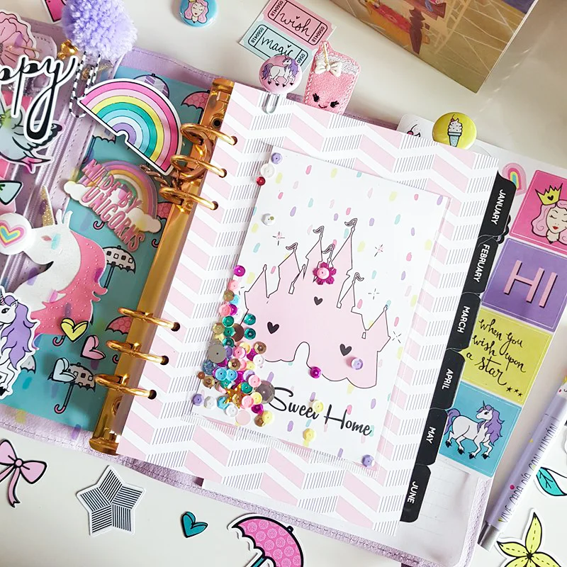
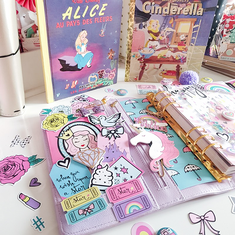
It’s Adeline, so glad to be on the Fairytale Club’s blog today sharing my lilac Kikki K. planner decorated with the “Everyday Wishes” kit.
 

01-Adeline-Blog-Post-2018-01-30-2.jpg

Last time I said that I love this kit so much because of its themes - dream, wish, love - but I also love it for its colors and design.
 

I chose to decorate my meal and home planner with this kit. I made a double dashboard with two sheets of paper.

First I used the acetate paper, and I superimposed it on a second sheet, and I made my decoration according to this second paper.

I decided to create a little shaker for my dashboard’s second page with the sequins and a project life card.

Finally I made my cover decor with Everyday Wishes’ ephemera (so girly!), and I added some of my paper clips like the unicorn - perfect with the kit!

I hope you have enjoyed my post.

Kiss from France,
Adeline
 

Everyday Memories with Enza

Hello, everyone! Enza here, and I'm back today with a new layout featuring the amazing Everyday Wishes kit.

PHOTO Main - Jan29-2.jpg

I love using die-cuts and dimensional elements on my pages. They add texture and color, and create lots of interest, especially when grouped together to form clusters. I started by backing a heart wreath cut file with several patterned papers from the kit. I was not sure how I wanted to add more dimension to it. I thought about adhering it down with foam adhesive, which is what I usually do, but ended up creating a shaker in the center of the wreath instead. Shakers are such a fun element and very simple to make. Here, I just adhered a piece of acetate to the cut file before gluing it down. Easy peasy. I love how the colorful sequins move around and make this layout more interactive. To jazz up the background, I also splattered some mist on it, making sure to use colors that coordinated with the papers in the kit.

For the photo, I created several layers behind it with patterned paper and embellished it with many die-cuts. The ticket stubs come from one of the cut-apart sheets. I simply stapled them together and used hearts in coordinating colors for a tone-on-tone look. The word die-cuts are perfect to create titles. There are so many of them! Again, I used foam adhesive to give it dimension.

To finish the layout, I added a small cluster of embellishments on the opposite side of the photo to balance it out.

That's all for today, friends. I hope you enjoyed reading about my process and will feel inspired to use some of these tips to add dimension to your next scrapbook layout. 


An Inspirational Polaroid Tag Banner with Tiffany

Hey everyone! Tiffany here with a fun tag banner project using the Everyday Wishes kit.

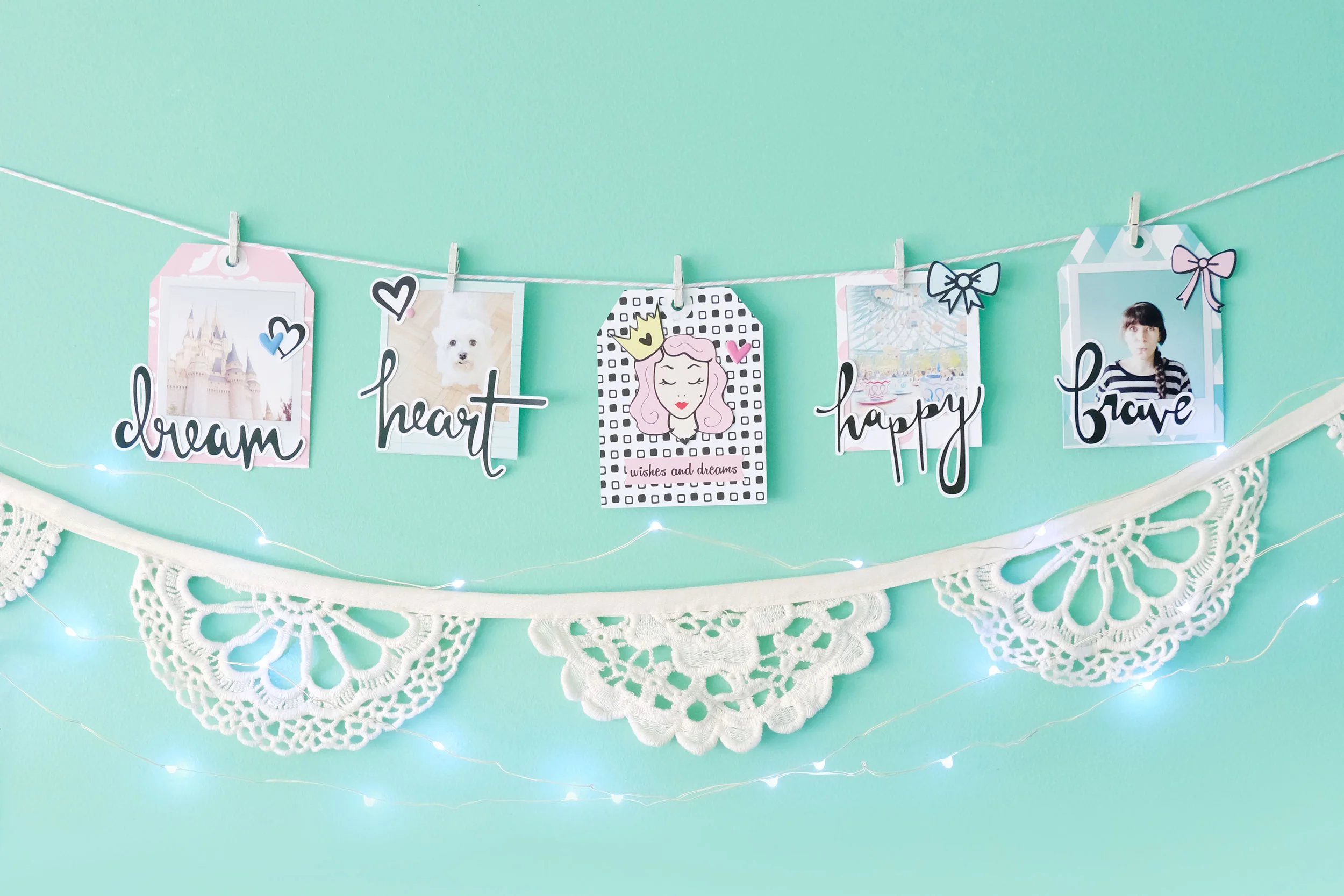
I wanted to do a different sort of project this time that not only you can use to document your life, but easily display it in your home as well to inspire you always. So I had a lot of fun creating this little banner from a few tags I made from the pattern papers. I even made these cute little polaroid frames to frame my photos and hang from the banner as well. I’m planning to display this banner over my dresser, so I can always see it and be inspired by it everyday.

TFC-BANNER-2.jpg

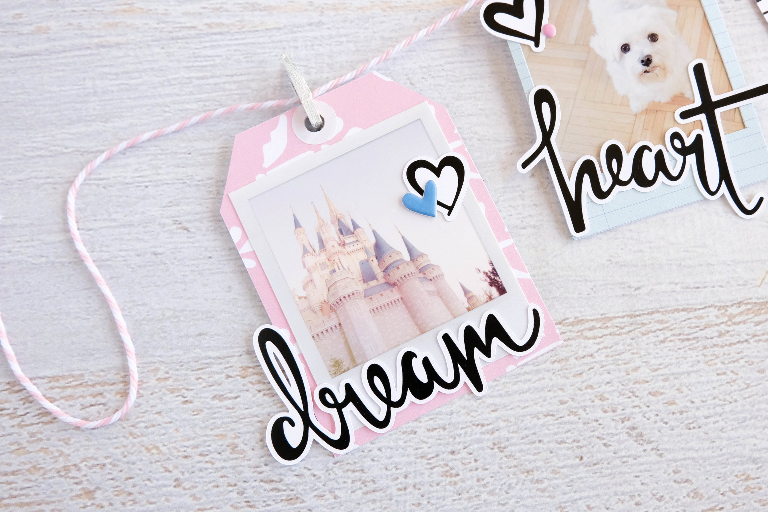
Before I strung everything on to a pink and white baker’s twine, I had to make each tag. I first printed out four photos I wanted to use on my banner and looking through the word die cuts from the kit, I pulled out words that I felt corresponded to each photo well. For my first tag, I used a photo of Cinderella’s castle at Disney World and the word “dream.” Disney for me is where dreams come alive and I felt it was so appropriate to use on this project with the Everyday Wishes kit.

I printed out my photo to already have a little white polaroid frame around it. Separately, I cut out a tag from one of the pattern papers to back my photo on. I then layered the “dream” die cut over it so that a bit of the word hung off the edge. I kept these tags simple, so I embellished it with a black and white heart die cut and a blue puffy heart sticker from the Take Note kit, before punching a hole at the top of the tag, reinforcing it with a white reinforcement sticker to make it look like a real tag. I attached it to my string with a mini wood clothesline pin that I painted white.

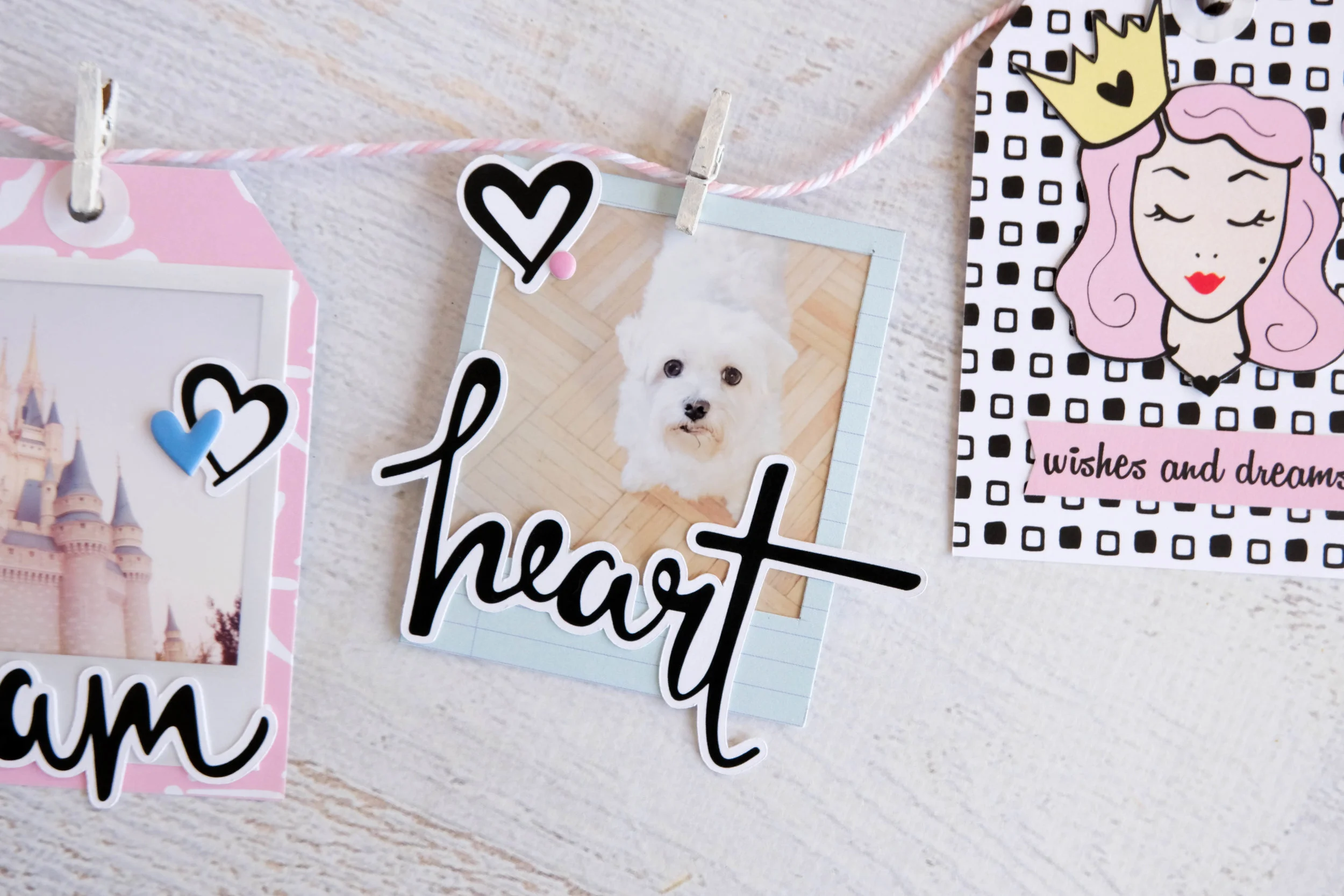
For my second “tag,” I cut out a polaroid frame from one of the papers to frame a photo of my dog Joey. I paired his photo with the word “heart” because I just love him so much and he’s a huge part of my life and my heart. I layered the die cut over the frame the same way I did with the previous tag, so a bit of the word hangs off the edge, then embellished the polaroid with another black and white heart die cut and a pink puffy dot sticker from the Take Note kit. I then hung it on my string with another white painted wood clothesline pin.

I repeated the tag process with this third tag, using this black and white square pattern from one of the planner dividers. Yet, instead of using a photograph, I fussy cut the princess image from one of the other dividers and pasted her in the center of the tag along with the “wishes and dreams” die cut that I cut into a banner. I embellished the tag with another puffy heart sticker, this time in pink.

For the fourth tag, I created another polaroid frame using the pink polka dot pattern paper. For this one, I used a photo of the Mad Hatter Tea Cups at Disneyland Paris and matched it with the word “happy.” This is by far one of my favorite rides at any of the Disney parks as it never fails to make me laugh. It is just the happiest ride ever. I wanted my banner to remind me to always be happy, so I thought this was the perfect way. I embellished this frame with one of the powder blue bow die cuts from the kit, so that it balanced out the pink.

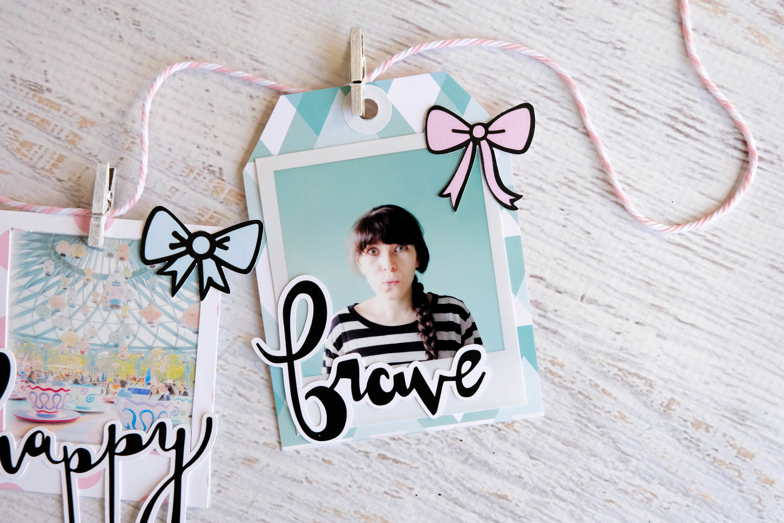
I made my last tag the same way I made the first one. I printed a photo of myself with a white polaroid frame around it and paired it with the word “brave.” I always strive to be more brave with my life, so again, this was the perfect reminder of that. Since I cut the tag from this minty blue pattern paper, I ended up embellishing it with a pink bow die cut to bring in a bit of the pink color to the tag. This particular tag is very mint/blue in color, so adding a little touch of pink helped it balance out.

I hope you enjoyed this simple cute little banner and that it inspires you to create your own!

TFC-BANNER-7.jpg

Adeline's Self-Care and Memory Traveler's Journal

Hi my Fairy Friends, It’s Adeline for the Fairytale Club blog today, I am so happy to see you.  I wish you a Happy New Year for 2018, so much love, and good health for your family and you.  For this new post, I decided to share with you a part of my self-care and memory traveler's journal.
 

27294381_595200174153091_1196694822_n.jpg

I follow a challenge named The Happy Place Club created by The Reset Girl, and each week I make my self-care homework!!!!!!!

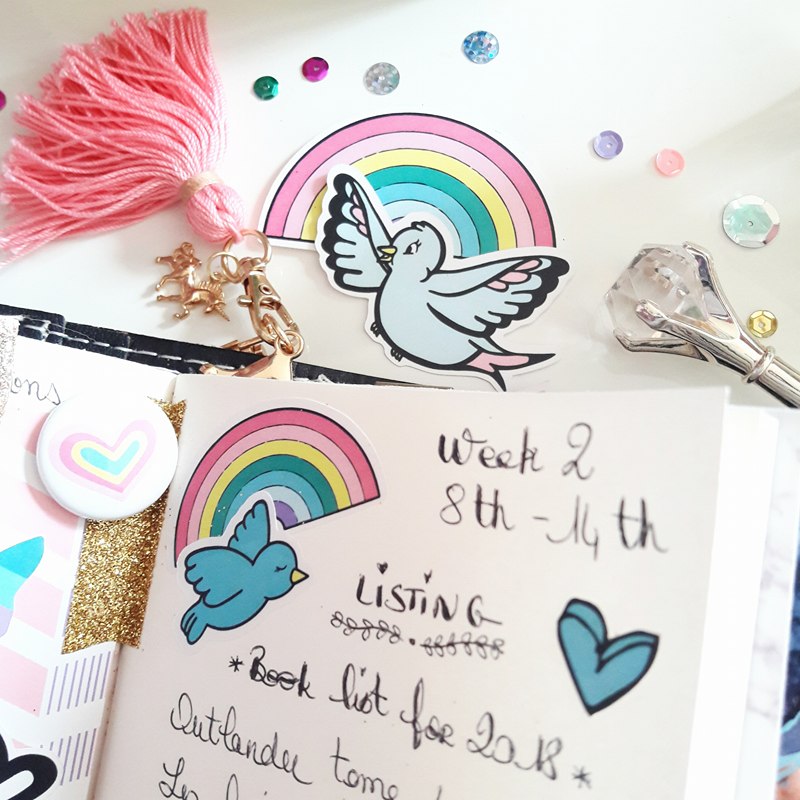
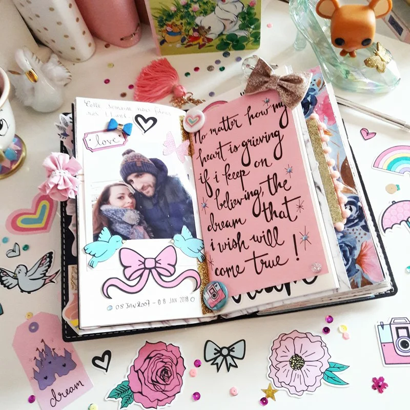
I decorated my week with the Everyday Wishes kit. I love it for the colors and my favorite Disney movie, Cinderella, inspired it!!!!! 

So let’s discover my second week of January with a special event!!!!!!! My love and I's 11th love birthday.

I hope you have enjoyed it, and I will see you later for a new planner set up post with the Everyday Wishes kit.

Wish, love and dream!!!!!

Kiss from France,
Adeline
 

Henny's Planner with Everyday Wishes

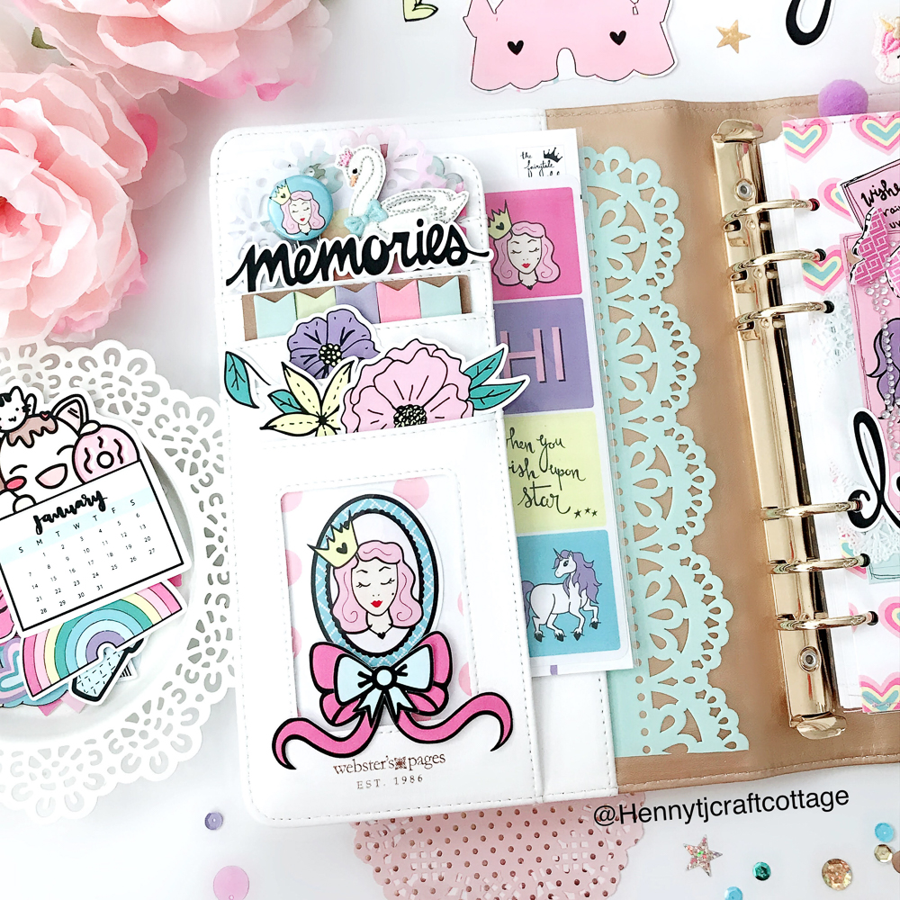
Hello everyone! Henny here, I hope everyone is having a wonderful day. So today I’m going to share with you a dashboard I have completed for my A5 ringed Planner. 

As you can see, this “Everyday Wishes” kit definitely reminds you of your favorite childhood story. It is just so lovely with pastel of a pale and heart warming delicate shade of color. The contents are full of princess things like castles, unicorns, hummingbirds, flowers .. just like living in a dreamy fairytale world. No matter what your age, fairy tales carry with them a certain magic. 

So, for the pockets, as usual one of the set ups I’ve always loved to do, I have filled them up and decorated them with some pretty die-cuts, stickers and embellishments from the kit.  And I added page flags from Target that coordinated perfectly with the kit. So it’s a pretty simple set up I can say, but sweet at the same time. 😊

Oh how I love how this dashboard turned out!  Isn’t it just lovely? I used one sheet of paper, folded it 2/3 to make a slide pocket, and punched the edge of the pocket with a lacy punch, then secured the ends of the folded paper by sewing them together to make one real pocket. 
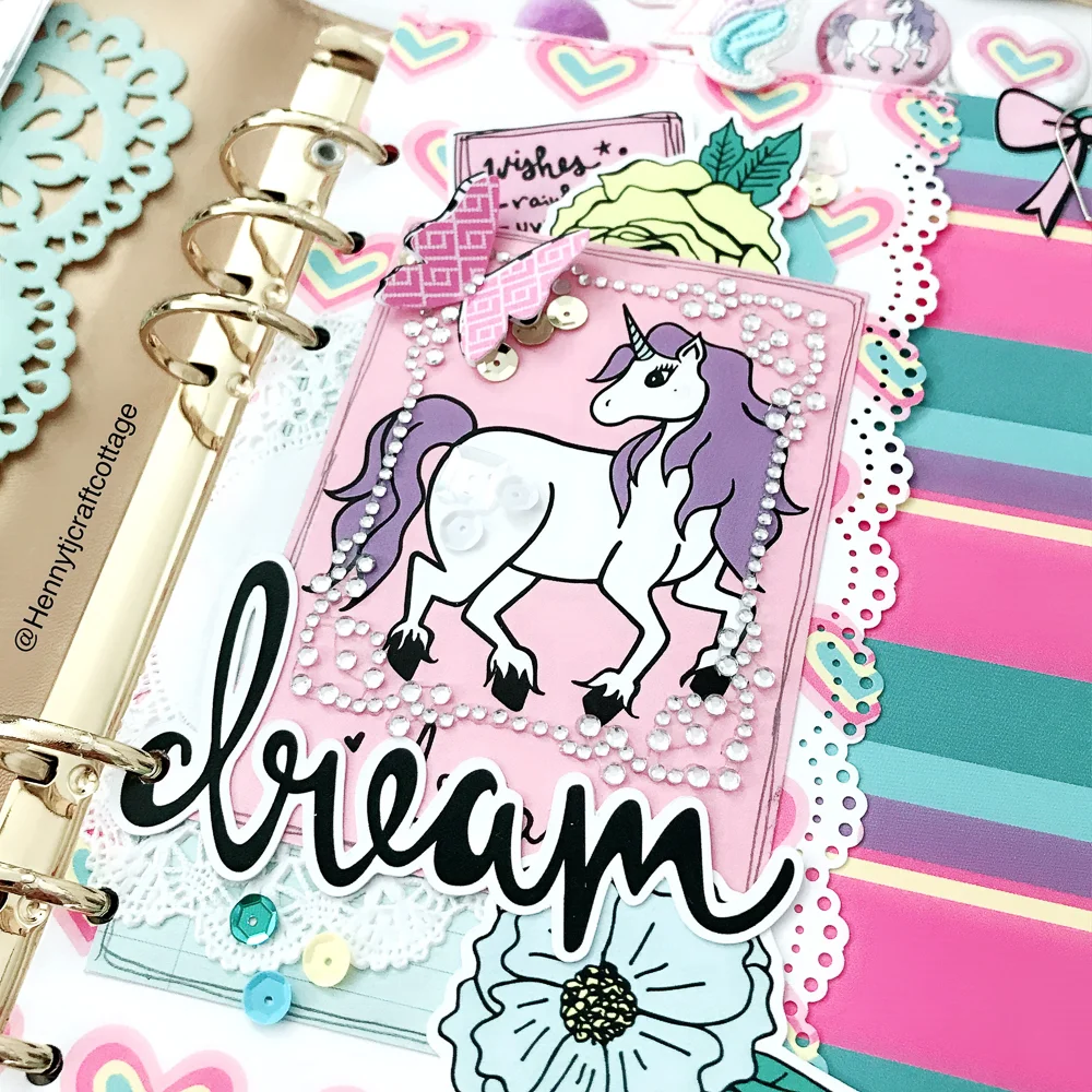
For the front side, I placed a couple of note cards from the kit, then just randomly decorated it by adding some embellishments that came from the kit, as well, except for the adhesive gem frame.

I created this dashboard with a slide pocket intended to use where you can slide in there your notes 📝, receipts, letters, stickers, photos, etc... 

For the back side of the dashboard I decided to make a secretarial with card sliding pocket just for an additional space I can use to put anything as i wish. 

So overall I’m really happy with how this dashboard project came out. I hope you’ve enjoyed looking through everything and that it gives you another idea to start your project with. 

If you haven’t ordered this kit yet, it’s still available to purchase, so make sure to get in and order yours today! 😉

I wish you a wonderful and happy day. 
Remember, fairytale does exist, always have faith and continue to dreams about it. Because fairytales, myths, and legends can help you make your own dreams and goals come true. ☺️

Sincerely yours,
Henny

Home, Sweet Home with Allie

Hello there! It's Allie here today sharing a layout using the Everyday Wishes collection. Today's page focuses on hand-stitching!

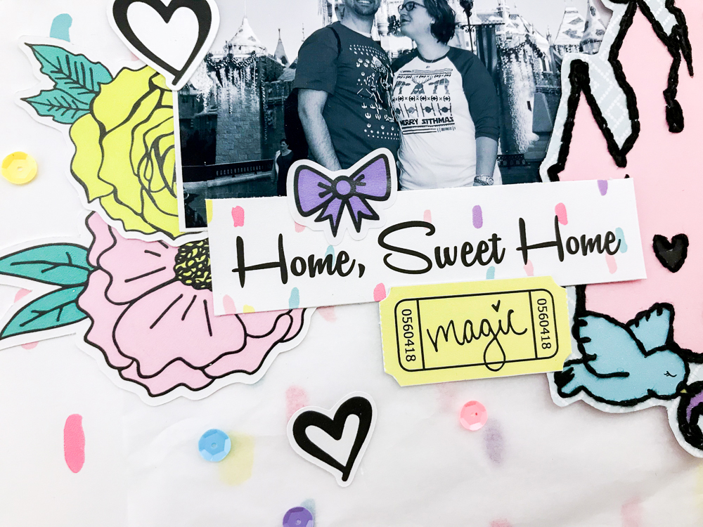
There were so many items in the kit that would look so cute with accent stitching, but I settled on this fun castle from the planner kit! I love the castles Andrea often includes in each kit, because they are so perfect for all my Disney photos!

I stitched around the castle design, and then cut it out to create a beautiful focal point for my page. I used the gorgeous "Dreams Do Come True" paper as my background. I added tissue paper on top of it to help tone down the design and have the photo stand out.

I used a picture from our recent trip to Disneyland, but converted it to black and white so the Christmas colors in the photo wouldn't compete with the colors of the page. 

IMG_6653.jpg

Finally, I finished off with embellishments. There are so many die cuts and stickers that it was hard to choose! I love the way it turned out. I had so much fun using all the beautiful patterns and colors. Thanks for joining me today!