Carrie's Sunshine & Snow Project Life Spread

02132019-PL-Snow-Day-01-Final.png

Hello Everybody, Carrie here with a February spread in my Project Life album. I used the gorgeous Practically Perfect Kit and gave it a bit of a love theme for February. We’ve been coated in a bunch on snow here in Seattle the last couple weeks which is not normal, so I wanted to make sure to document some of our snow days. These photos are a little over a week old and we have so much more snow now it’s crazy. The photos from this day in particular are some of my favorites because of the snow and sunshine together, as well as my daughter playing in the yard with one of our dogs.

02132019-PL-Snow-Day-02.png

To begin this spread I quickly decided on using a pocket page of three 4x6 inch photos. I placed the photo of my daughter in the middle and cut two 4x6 inch cards from one of the 12x12 inch floral papers. The floral paper cards I added to the pockets above and below my photo. Next I decided to use two sizes of heart shaped dies and cut a bunch of hearts out of solids sections of paper from some of the planner inserts.

02132019-PL-Snow-Day-04-Final.png

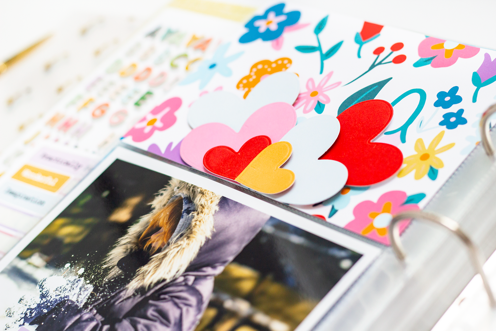
I layered the die cut hearts together on the floral cardstock both above and below my photo. To give them a little dimension I used red line tape at the bottom of each heart and a thin foam adhesive at the top.

02132019-PL-Snow-Day-05-Final.png

As a final touch for this side I used the “superclifragilistic” and “expialidocious” stickers from the sticker sheet and added them with a thin foam adhesive. To give a little more interest I decided to place one on my photo and the other on the paper below.

02132019-PL-Snow-Day-06.png

On the opposite page I started out by adding the “s” and “p” in Pink Paislee Thickers to one of the 2x3 inch photos (it’s a photo of snow), to identify my daughter and our dog. I used the same pink paper as one of the heart dies to fill in the empty space of the “p” because I feel like it makes the letters easier to read and I like the look. To help tell the story of my daughter’s relationship with our dog Ponyo, I also decided to use one of my small heart punches and punched out a heart from one of the same red papers as the other hearts. I used foam adhesive and placed it in between the two initials. To finish off this little 3x4 inch pocket I added the super cute yellow pom pom paperclip from the stationery pack. I love seeing these pom poms stick out of my albums.

02132019-PL-Snow-Day-07.png

Once I had the rest of my photos placed for this 9x12 inch page I added the cute yellow quote card from one of the cut apart sheets in an empty 3x4 inch pocket. I could have left it just like that but thought that the two penguins reminded me of my daughter and Ponyo playing in the snow. Because I didn’t have a lot of space on the card I cut the smallest pair of penguins out of one of the cut apart sheets. I added them to the card with red line tape at the bottom and foam adhesive at the top. To help tell the story of the pair having fun I also placed the “yay” sticker from the sticker sheet, tucking one end under a penguin and popping up the other end with foam adhesive.

02132019-PL-Snow-Day-08.png

I knew I wanted to add journaling to the last 3x4 inch pocket so I cut a notepaper card from one of the planner inserts. Typically I’ll add journaling using my typewriter, but this time decided that the photos told enough of the story that all I wanted to write was a descriptive title and the date. I used the same Pink Paislee Thickers for my text and used the same pink paper to fill in the empty spaces in the letters. To help tie in the floral paper I decided to add the red tulip die cut from the die cut pack, again only popping up the top with foam adhesive and tucking the bottom into the text. Since I thought the sunshine and snow were so pretty together I also placed the “wow” sticker from the sticker sheet above the flower using foam adhesive…..and that’s it!

Thanks so much for taking a look at my project and I’ll see you next time : ) Carrie
02132019-PL-Snow-Day-03.png

October Daily Day 1 with Carrie, featuring "Magical and Mischievous"

Hello Everybody! Carrie here using the new “Magical and Mischievous” kit for scrapbooking day 1 in my October Daily!! This is my favorite and biggest project of the year! I do also participate in Andrea's Holidaily, however, my album for that is always much smaller since I don't take as many photos. October is my favorite month of the year and I take LOTS of pics this month lol!

10082018-OctDaily-01.png
10082018-OctDaily-07.png

For October 1st I have a bunch of photos of my front garden. I worked really hard on it this summer and didn't really get any photos of the garden in it's prime, so I wanted to make sure to cover all my bases and get pics of everything. The left side of the spread is just three 4x6 inch photos. The middle photo is cut in half since that's the format of page protector I chose. For the right side, I cut one of the 12x12 inch papers down to 6x12 inches and chose this AMAZING hand drawn spider web print for my background. I used my typewriter to add the journaling onto a 3x4 inch light pink notebook ruled card, which I cut from one of the planner inserts. I chose to use the typewriter since there was so much to fit into a small space. The card is slightly popped up using some foam paper and adhered with red line tape.

10082018-OctDaily-08.png

The "OCT" above the card are Thickers from American Crafts in the font Maggie. I love these for Halloween since they're black glitter with orange foam peeking through. To make the "OCT" stand out just a little bit more I added some purple paper cut from one of the planner inserts.

Below the journal card I used the square number 1 from the number cut apart sheet to label this as October 1st. I popped up the banner from the die cut pack that says "A Magical Day" just below the 1 with thin foam dots. The square number one is also slightly popped up using a little foam paper. To finish off this page and add a little more color and embellishment I tucked in three of the die cut leaves and called it good ; )

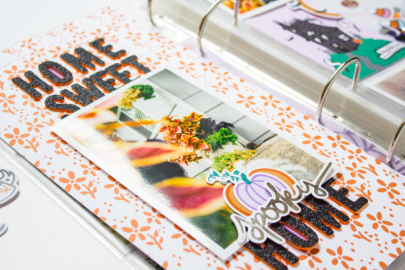
Since I have even more photos for Day 1, I decided not to exclude them and just add in another spread. For the left side I chose to use the backside of the spiderweb paper which is this gorgeous dainty orange floral. This fits in PERFECTLY with the theme of my garden photos....I LOVE IT! LOL! Anyways, first I added the "Home Sweet Home" title using the same Thickers. I used the same purple paper to back the empty space in the "O"s. Next, I added my 4x6 inch photo which is slightly popped up onto a thin foam paper. Then I added the silver foil "spooky" to change the saying to "Home Sweet Spooky Home."

Lastly, I layered two pumpkins from the die cut pack on top of each other and tucked them slightly under the "spooky". The way they're layered together almost looks like a rainbow which I think is super cute!

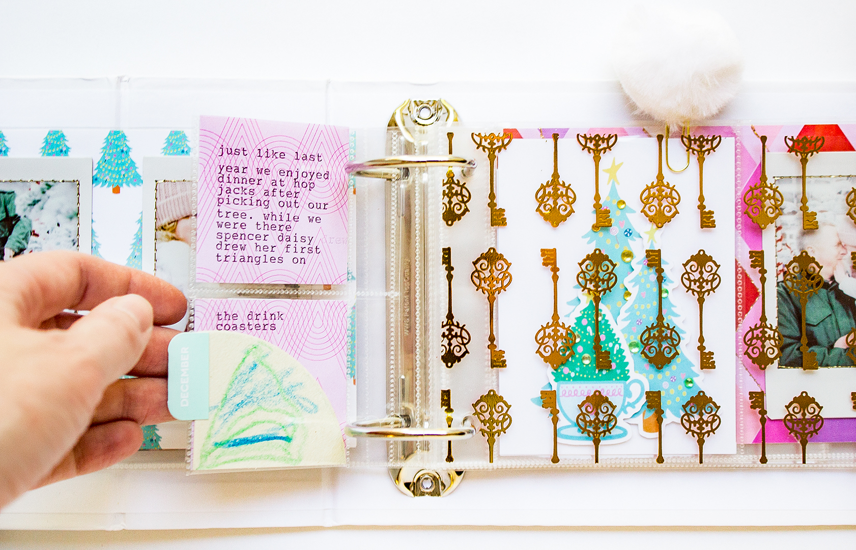
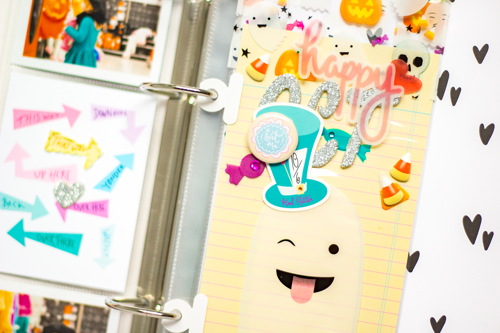
For the opposite page I used the flair button with the orange pumpkin face heart and placed it in the empty space of the bottom photo, in between our rain boots. The cute haunted house filler card from one of the cut apart sheets fit in perfectly with my "house" theme for this spread so I added it in the left center pocket. To add just a little dimension, I popped up the moon with bats from the die cut pack. For the center pocket to the right I made a shaker card using some of the sequin mix from the kit, as well as the three candy corn die cuts from the die cut pack. The see through effect is a favorite technique of mine. To finish this spread off I added the purple pom pom paper clip to the top photo. It looks ADORABLE popping out of the top of my album!! I will probably use all four in this project because it's so cute!

Thanks for taking a look at my project, and I'll see you next time for more of my October Daily! : ) Carrie

Adeline's Weekly Layout using "Tiki, I Love You!"

Hi my fairy friends,

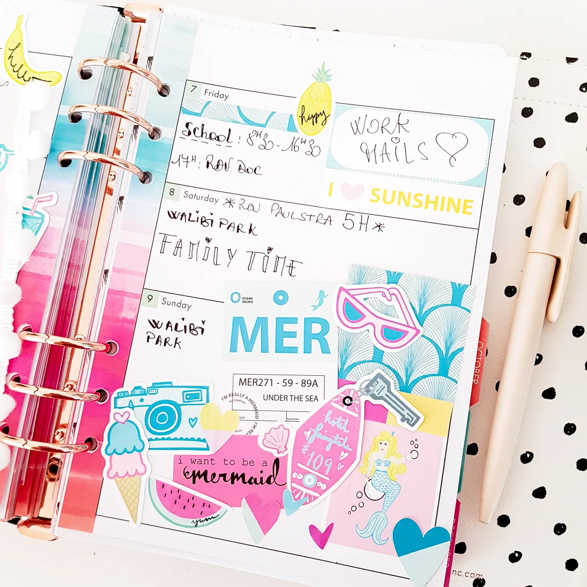
It's Adeline here today! I hope you're fine. Sunny days may be gone, but in my planner it is still summer thanks to the “Tiki, I love you” kit!!!!!! I made my week layout with it.

Tiki week layout 1.jpeg

The bright colors and the trip theme are good because this weekend we are going to an amusement park called Walibi!! This name seems tropical but it is in Belgium!! LOL

Tiki week layout 2.jpeg

I knew the kit was going to be great for the trip.

What I like to do with my weekly layouts is to put pretty things that make me want to work or to accomplish my daily tasks. Do you do that, too?

I used so many elements from the kit, including pieces of paper I cut and stickers and ephemera that I’ve accumulated.

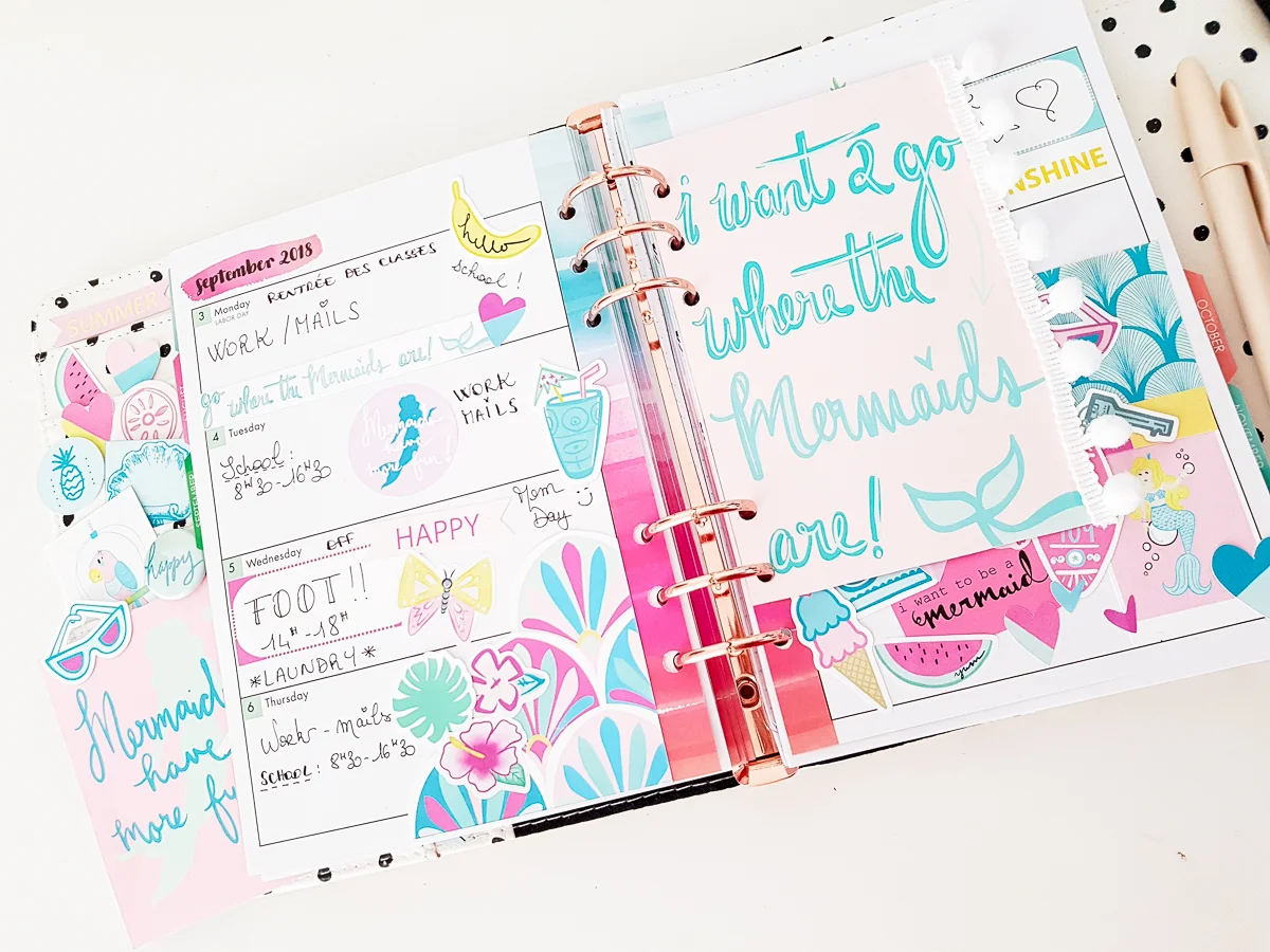
I also cut out the project life card with a perfect quote : "I want 2 go where the mermaids are!" and used it in my planner - I just added a pom pom ribbon.

I wish you a good day, and I’ll see you soon for another post.

Tiki week layout 7.jpg

Kisses from France,

Adeline

Adding Glitter Splatter with Carrie

Hello Everybody!  It's Carrie here with my first post using the gorgeous Hello Beautiful Kit, as well as my first post as an official design team member : )
Today I'm sharing a 6x12 layout that I've now placed directly into my 6x12 Project Life album for April. Yay!!  We recently did a little exploring here in Seattle, and I snapped a few photos from a visit to a lovely Japanese Garden.  The actual photo on the layout was taken just outside the gardens, but it is currently sitting next to photos from inside.  It was such a beautiful place to visit I'm already looking forward to going back!

To start out creating this layout I took the colorful striped sheet of 12x12 paper from the kit and cut it down to 6x12.  Then, I used some watered down Martha Stewart Crafts Pearl Paint and splattered it all over my paper using a paintbrush.  Before the paint dried I added this ultra fine iridescent glitter to the paint to create a "glitter splatter".  To keep the glitter from rubbing off once it dried I sprayed a clear archival sealer all over.  Works like a charm every time!

Next, I added my full size 4x6 inch photo directly onto the paper and popped it up using a rectangle piece of foam paper I trimmed to size using scissors.  Since the green in my photo was a different shade then the green on the paper it was an easy decision to place it there.  

With my husband and daughter in the background of my flower photo I decided to use the "you are my favorite" die cuts from the phrase die cut pack.  I also popped them up but this time used foam adhesive.  I think having the pink words next to the pink paper creates pleasant movement for the eye, so that was another easy choice for me.

At this point I decided that the large butterfly from one of the planner inserts would be a great statement piece, so I fussy cut it out.  To add a little more interest to the butterfly I used yellow and lime green Stickels to color in a little here and there.  At first I was worried about there being too much glitter, but the background splatter is so subtle that it ended up working out just fine.

Before attaching the butterfly I ended up using embroidery thread along two lines at the top and one at the bottom of the layout.  To make the process as quick as possible, I used my speedy sewing machine to do the hard part of making the straight lines of holes in my paper.  Then, I just matched up the different shades of blue and yellow and embroidered while I watched some Netflix.  Because my layout is so busy but yet still somehow simple, adding in the matching thread adds that little extra element without it being too much.

To finish the page I added my butterfly, popping up the edge of the wings with foam adhesive and that's it!  All in all other than the photo, I think my favorite part of the layout is the glitter splatter.  I haven't used that technique in a while and I just love the way it pops through the different elements on the page.  I hope you enjoyed today's post, and I'll see you next time!

Adding Patterned Paper to Project Life with Carrie

Hello Everybody!  Carrie here, today!  Since Valentine's Day is right around the corner I thought it would be fun to share a spread in my Project Life album inspired by love and hearts and unicorns!!  
This spread is also one example of how I like to add patterned paper into my 6x12" Project Life.  I don't know about you, but patterned paper might be my favorite scrapbook product, and since there are so many gorgeous papers in the Everyday Wishes Kit I'll take any chance I can to add it in ; )

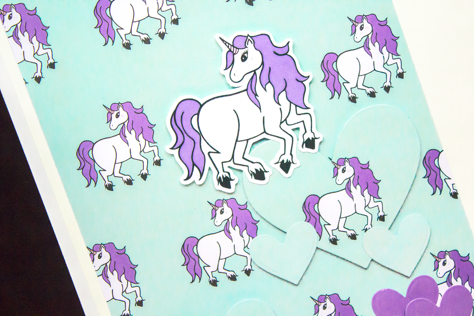
As you can see the left side of the page is a full 6x12" photo, but you could easily replace it with three 4x6" photos if you like and I think that would also look great.  On the right side I used the lovely unicorn patterned paper from the Everyday Wishes kit to fill up the whole page.....and I think I should mention, I don't always embellish on top of a full patterned paper page.  Sometimes I only add a single embellishment in the middle or a number or a word.  However, for this spread I knew I wanted to add in hearts since I love my daughter to bits, along with the phrase "You're a limited edition" to go along with my quirky photo.

The kit came with these awesome black and white word die-cuts and two of them were "you" and "are".  So I decided to change my phrasing just slightly to "You are a limited edition."  I used some older Dear Lizzy thickers for the rest of the words, and I like how they are gold with pink underneath to compliment the rest of the purple on the page.  To help make it all stand out, I also cut some white bits from one of the patterned papers and layered them under a few of the thickers with holes.

The unicorn theme was perfect for this spread since I was talking about a "limited edition", so to emphasize it I popped up the unicorn die-cut towards the top of the page.  Next, I started cutting a bunch of different hearts out of matching papers from the kit.  For the solid blue and solid purple, I used one of the cut apart sheets, and for the hearts with the unicorns on them I used the second half of the background patterned paper.  They are all layered with most of them popped up.

At this point I knew I was pretty much done but wanted to add in a little more black.  So I found this little blue script heart die-cut outlined in black and tucked it into the "y" in you....and that's it!  I know it's simple, but I don't make the time for proper layouts these days.  So a photo, pretty paper, a simple phase, and some hearts in my Project Life album feels great!

Thanks for taking a look, and I'll see you next time.  
Cheers! Carrie

Carrie's January Project Life Spreads

Hello Everybody!  It's that time of the month where I start to work on my Project Life spreads for January!! 

Over the years I've found that since I don't take photos very often I enjoy a monthly format of documenting best.  I tend to take photos of events I want to remember, meals I like, my current favorite mug, etc....you get the picture.  So today I have a couple spreads from the end of January where I showed my daughter Fantasia 2000 for the first time, as well as a bouquet of flowers we put together to remind us of Spring.

Above you can see this first layout has a couple photos from watching Fantasia 2000.  My daughter is laying on the floor in her jammies.  The lady in green is a photo I took with my camera of the TV screen during one of our favorite songs / scenes.  The 6x12 photo is actually a double photo where I took another picture of the TV screen and layered it over a photo of our living room with the bouquet of flowers in the foreground.  I layered them together using Photoshop, and once printed added a thin strip of purple paper to the bottom.  I can't believe how well the product from the Everyday Wishes Kit matched up with the colors of my photos!  In case you didn't know, I'm all about color, color and more color lol!!  This spread was a dream to put together!  Here are more of the details:

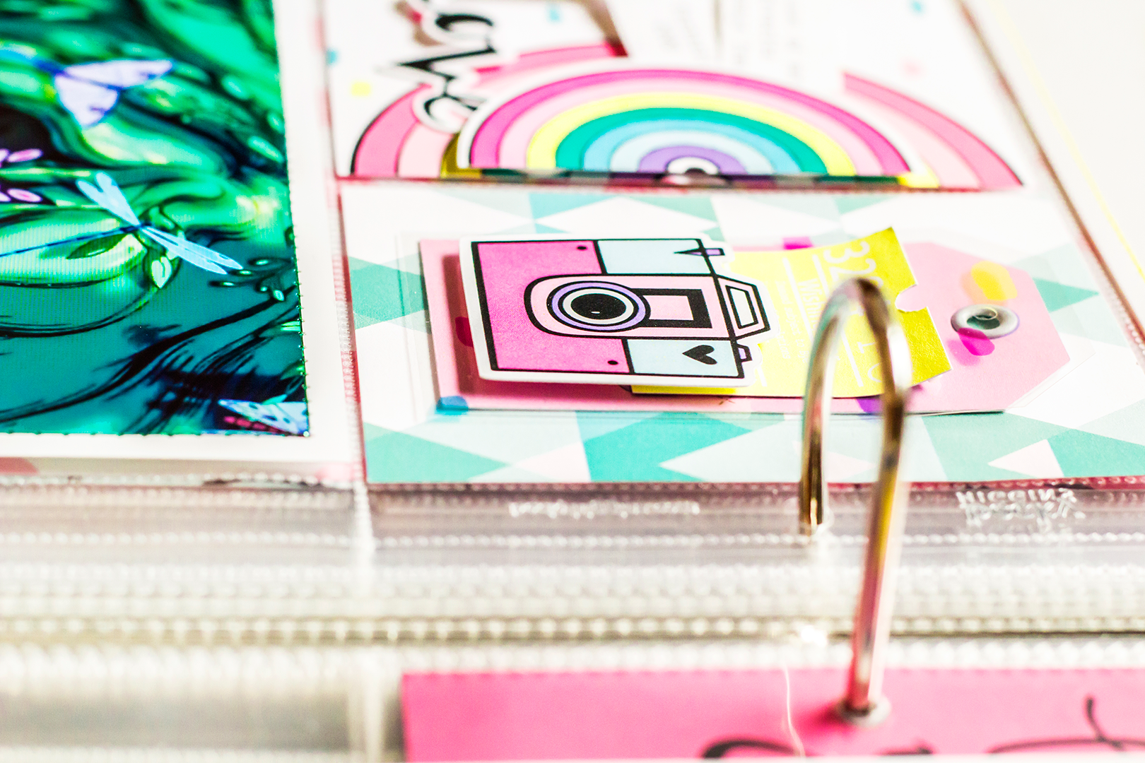
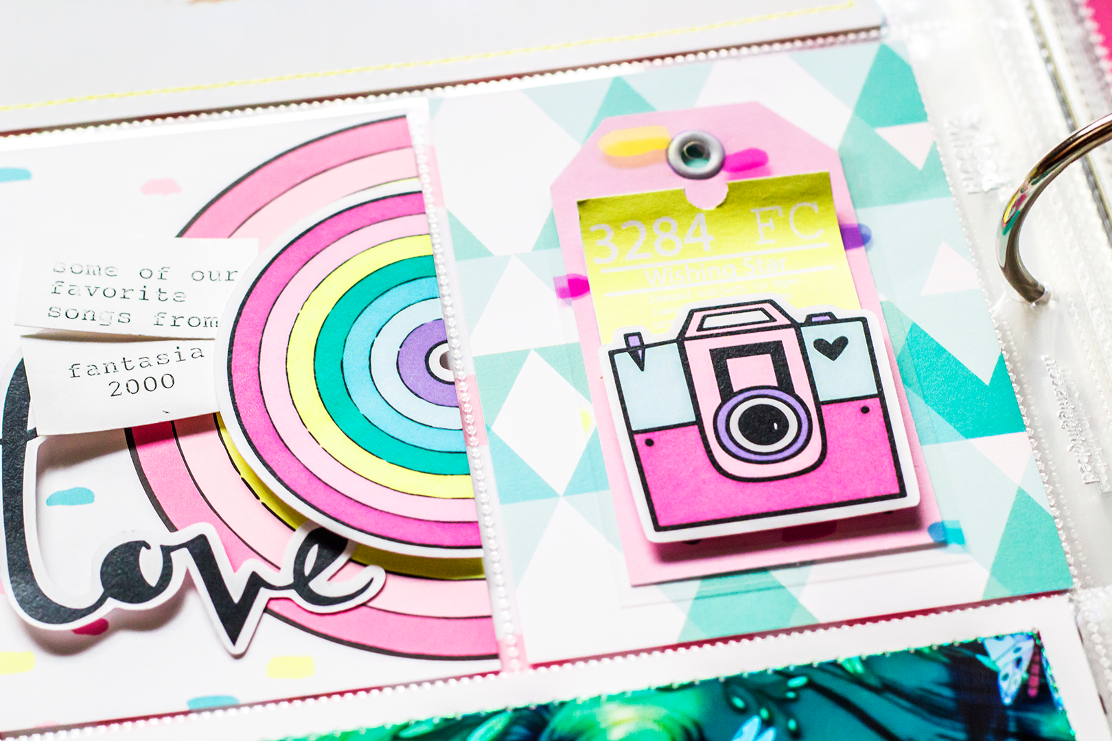
The two 3x4 pockets are filled with lots of layers!  I used a yellow ticket from the cut apart sheet and curled the end up, tucking it under the die cut camera.  The gorgeous transparency is layered under it all while resting on top of a tag from the cut apart sheet.  I added an eyelet to the tag for fun.  Here you can also see a peek at some of the green shimmer stitching around the border of the photo at the bottom.

I used the shimmery green thread for the two photos I took of the TV, and the yellow for the pic with my daughter.  (The pink thread is used on my next spread.)

Adding this extra touch of thread to the borders of my photos made them all pop just a little bit more.  Plus, I love the added texture ; )

Here's a better look at both 3x4 cards.  I believe the card with the rainbow is cut down from a planner insert.  It is layered with the die-cut rainbow and the script word "love".  The left side of "love" is popped up while the right side isn't.  I did something similar with the yellow tag.  To add just a little journaling, I used my typewriter and some white cardstock.  Most of my journaling for this "event" will be on a spread that comes before this page (which is not yet completed), so I wasn't worried about adding a lot of text here.

And that's it for the first spread!  On to the next!!

This spread is actually next in order in my album!  There is a 6x12 photo of my daughter acting all moody and cute.  We had all woke up with colds this day and I think her face says a lot : )  Across the page I made a tag out of two of the planner inserts adhered back to back.  All I did cut cut the corners at the top and add an eyelet.  Below it is a close up of our flower bouquet.

Here you can see some of the pink thread I used around the border of my photo.

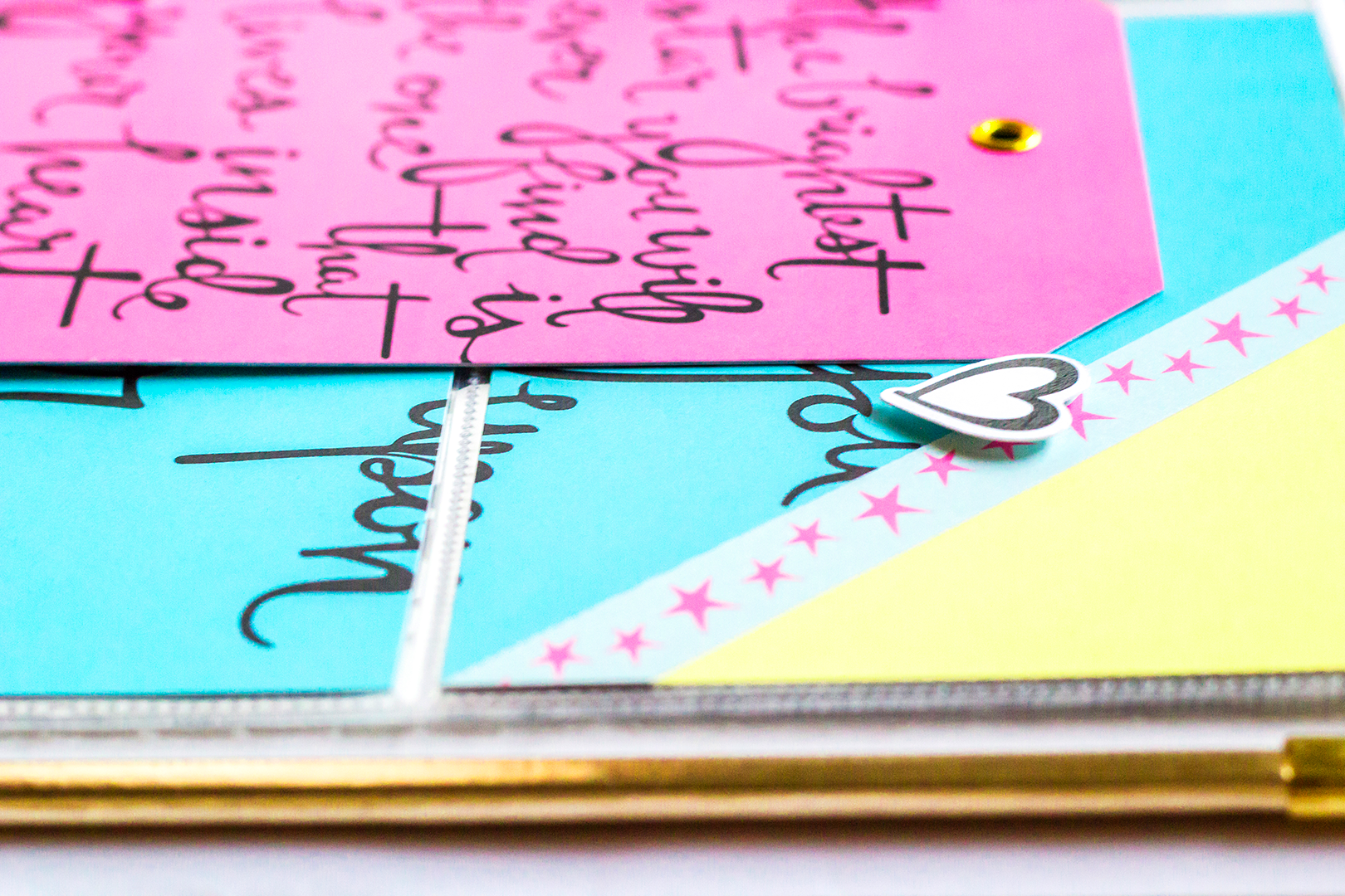
Love the quote Andrea used for this!

This is what you see when you flip the tag over.  I used a 6x8 planner insert and cut it into a 4x6 and two 3x4 cards.  The piece of paper with the pink stars on blue is part of a border strip that I added in between the yellow and blue of the 4x6 card.  I don't always play the rule of three, but the added pink from the stars makes a triangle of pink across this spread. Plus, it's more stars which goes great with the quote!

I also popped up a die-cut heart between the blue background and star strip.

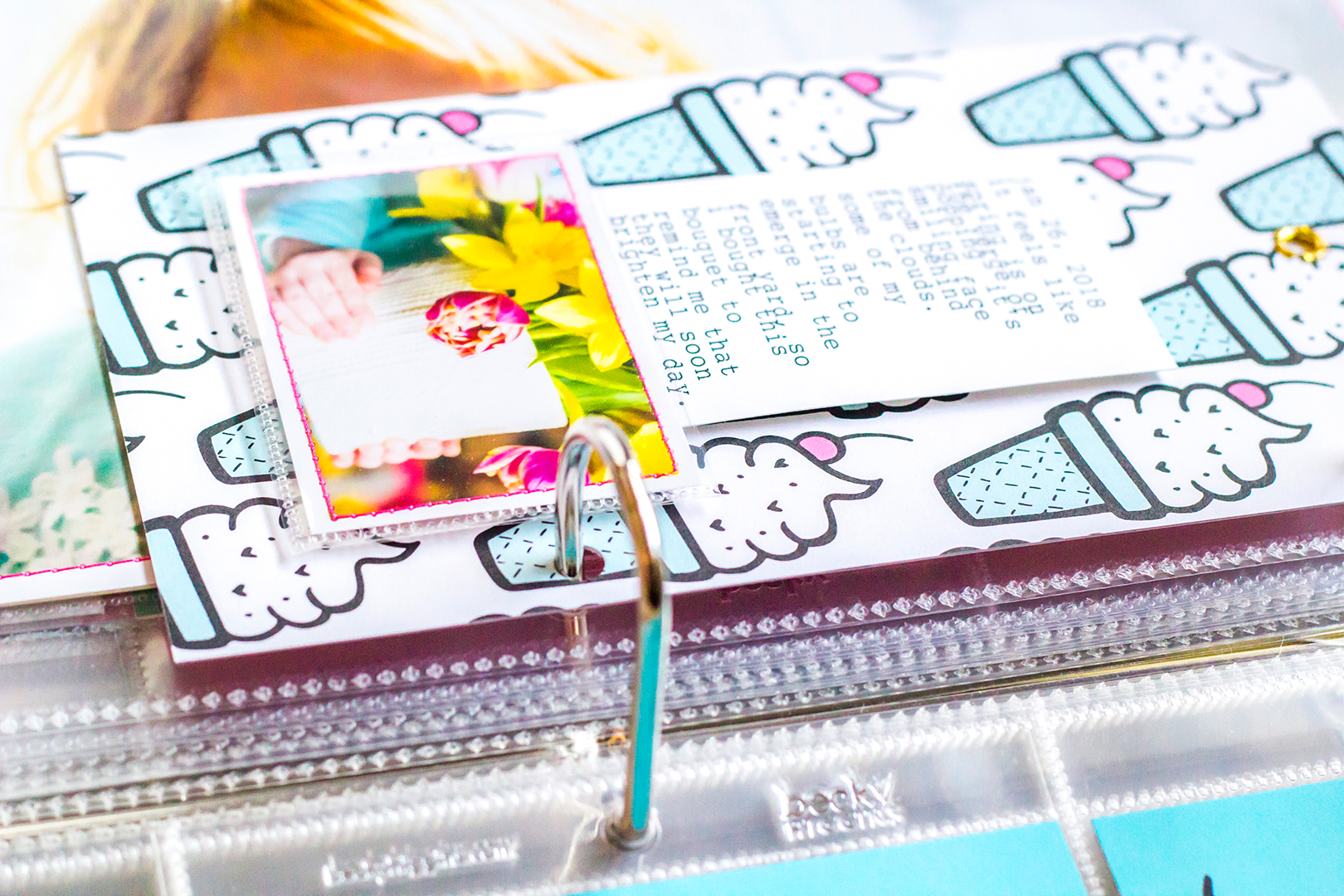
And here's a closer look at the back of the tag.  How cute are those ice cream cones!?!  Anyways, I used my typewriter and white cardstock to add journaling about our bouquet and tucked the bottom under my little photo.  You can see there's pink thread around the border of this photo as well.

Since this is my first time having my photos printed on glossy paper, I wasn't loving all the fingerprints.  So, I made a custom size pocket for my mini photo using the Fuse tool.  It's closed on three sides and still open at the top so I can take it out if I want.  

And that's pretty much it.  Hope you enjoyed a look at some of my Project Life for January.  See ya next time : )

Cheers!  Carrie