Laura's "True Fairytale" Layout

Hello everyone! It's Laura here, and today I am so thrilled to be back sharing my second layout this month, this time using a cut file.

I loved all the designs, but the woodsy, leafy look of this frame in particular stood out to me.  In 2014 I was lucky enough to do some traveling in Europe, and I have been using the Hello Beautiful kit to scrap some photos from my time in Germany.  In this case I used a photo of my mom and me at a castle we visited.  

I decided to cut out the frame as large as possible on a piece of 12x12 paper, and weave in some roses I cut from the patterned paper in the Hello Beautiful kit.  I used the pink ledger paper as my background and added a bit of mixed media water color to the background.  

To really make the page special I took a photo of the castle we visited and edited it in photoshop so it was a black silhouette, and made my own custom die cut to line the inside of the frame.  My goal was to make it match the black border and look like the vines were growing up and around the outline of the castle.  The mixed media helped blend it in with the frame.  

A few embellishments from the kit helped finished off this special page, and I'm happy to have another part of this trip documented in my scrapbook.

Dianna's Monthly Planner Spread and Tag Place Holder

Hello beauties! It’s Dianna, and I’m back this week to show you how I used the “Hello Beautiful” kit to decorate my monthly spread. I also made a tag page marker!! Here we go: 

For the left side of my monthly spread I started by filling the empty spaces with some yummy layers of paper from the kit!  At the top I used a piece of the Fairytales paper and two die cuts (the pink flower and the word die cut "Spring"). At the bottom I used some of the vellum and layered it with aqua and a “You are beautiful die cut”. The vellum is a new addition to the kit this month! It’s gold foiled and gorgeous! Under that I glued some frilly laces and then added some washi above and a couple of stickers where I had important dates. 

On the right side of the monthly calendar I used those flower die cuts. They are my all time favorite!  Under them I layered more of the Fairytales paper (both sides! It has a wonderful handwritten look text). Some more trims below, washi and a bow die cut I used as a sticker to mark a date! Here’s a look at the full spread: 

I also created a tag page marker! 

This tag is super cute! Used my favorite Fairytales paper again! I just measured it to be a little smaller than my actual pages. Layered on some of the black polka dot and the back of the aqua paper. This flower I cut from the “Enchanted Forest” paper and of course added some more lace! Above the layers I added the word die cuts and that cute birdie(another fave!)  I punched a hole in the top after adding a heart punched from one of the papers and strung some pretty trims through! These look lovely coming out the top of my planner!!! 

Here are a few detailed shots: 

Happy Friday! Hope you all have a beautiful weekend!! 

Xoxo,
Dianna
 

Adding Patterned Paper to Project Life with Carrie

Hello Everybody!  Carrie here, today!  Since Valentine's Day is right around the corner I thought it would be fun to share a spread in my Project Life album inspired by love and hearts and unicorns!!  

This spread is also one example of how I like to add patterned paper into my 6x12" Project Life.  I don't know about you, but patterned paper might be my favorite scrapbook product, and since there are so many gorgeous papers in the Everyday Wishes Kit I'll take any chance I can to add it in ; )

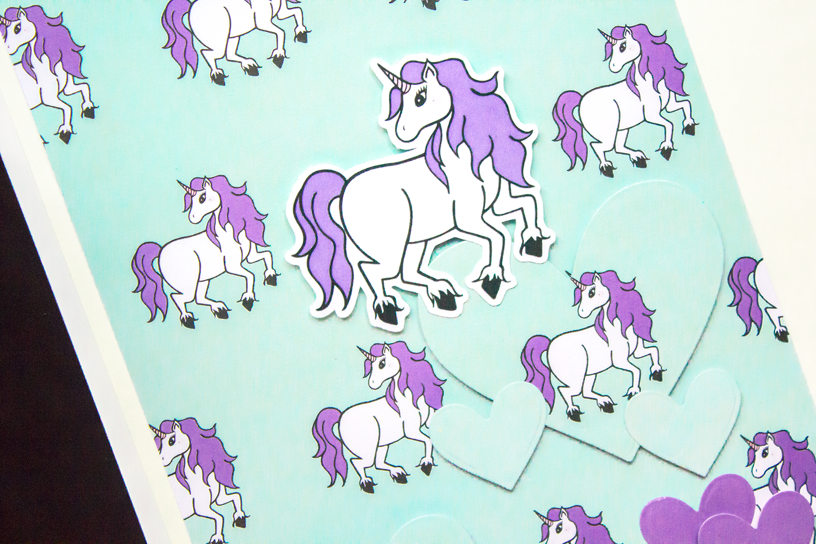
As you can see the left side of the page is a full 6x12" photo, but you could easily replace it with three 4x6" photos if you like and I think that would also look great.  On the right side I used the lovely unicorn patterned paper from the Everyday Wishes kit to fill up the whole page.....and I think I should mention, I don't always embellish on top of a full patterned paper page.  Sometimes I only add a single embellishment in the middle or a number or a word.  However, for this spread I knew I wanted to add in hearts since I love my daughter to bits, along with the phrase "You're a limited edition" to go along with my quirky photo.

The kit came with these awesome black and white word die-cuts and two of them were "you" and "are".  So I decided to change my phrasing just slightly to "You are a limited edition."  I used some older Dear Lizzy thickers for the rest of the words, and I like how they are gold with pink underneath to compliment the rest of the purple on the page.  To help make it all stand out, I also cut some white bits from one of the patterned papers and layered them under a few of the thickers with holes.

The unicorn theme was perfect for this spread since I was talking about a "limited edition", so to emphasize it I popped up the unicorn die-cut towards the top of the page.  Next, I started cutting a bunch of different hearts out of matching papers from the kit.  For the solid blue and solid purple, I used one of the cut apart sheets, and for the hearts with the unicorns on them I used the second half of the background patterned paper.  They are all layered with most of them popped up.

At this point I knew I was pretty much done but wanted to add in a little more black.  So I found this little blue script heart die-cut outlined in black and tucked it into the "y" in you....and that's it!  I know it's simple, but I don't make the time for proper layouts these days.  So a photo, pretty paper, a simple phase, and some hearts in my Project Life album feels great!

Thanks for taking a look, and I'll see you next time.  
Cheers! Carrie

An Inspirational Polaroid Tag Banner with Tiffany

Hey everyone! Tiffany here with a fun tag banner project using the Everyday Wishes kit.

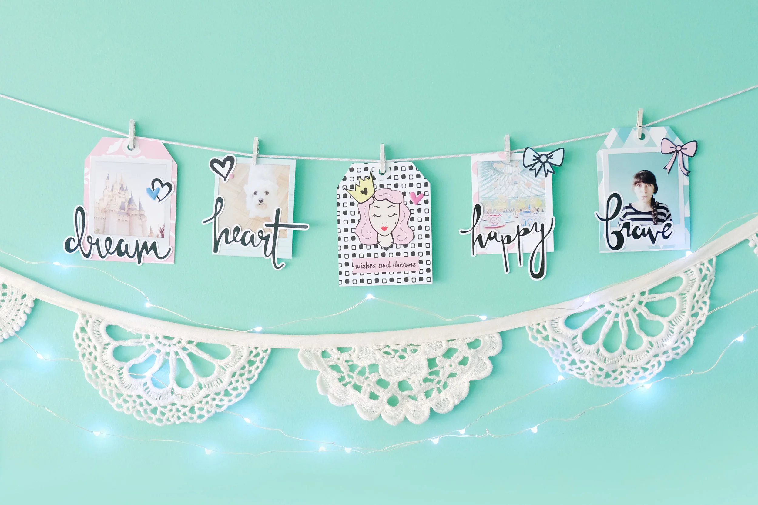
I wanted to do a different sort of project this time that not only you can use to document your life, but easily display it in your home as well to inspire you always. So I had a lot of fun creating this little banner from a few tags I made from the pattern papers. I even made these cute little polaroid frames to frame my photos and hang from the banner as well. I’m planning to display this banner over my dresser, so I can always see it and be inspired by it everyday.

TFC-BANNER-2.jpg

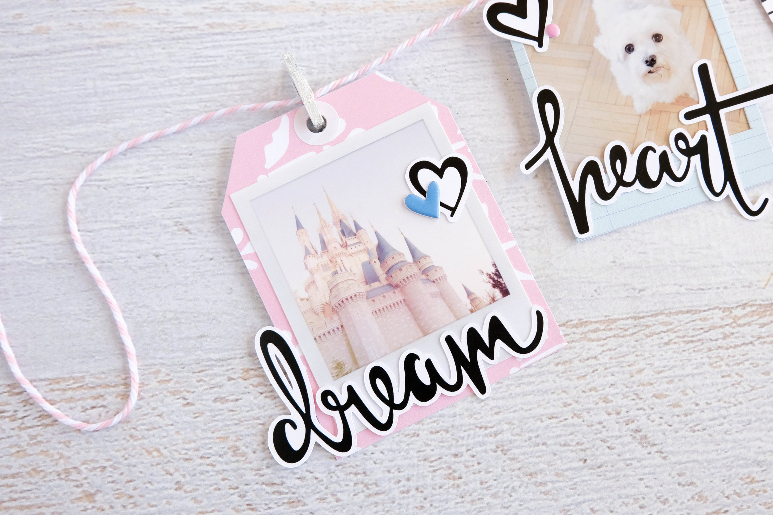
Before I strung everything on to a pink and white baker’s twine, I had to make each tag. I first printed out four photos I wanted to use on my banner and looking through the word die cuts from the kit, I pulled out words that I felt corresponded to each photo well. For my first tag, I used a photo of Cinderella’s castle at Disney World and the word “dream.” Disney for me is where dreams come alive and I felt it was so appropriate to use on this project with the Everyday Wishes kit.

I printed out my photo to already have a little white polaroid frame around it. Separately, I cut out a tag from one of the pattern papers to back my photo on. I then layered the “dream” die cut over it so that a bit of the word hung off the edge. I kept these tags simple, so I embellished it with a black and white heart die cut and a blue puffy heart sticker from the Take Note kit, before punching a hole at the top of the tag, reinforcing it with a white reinforcement sticker to make it look like a real tag. I attached it to my string with a mini wood clothesline pin that I painted white.

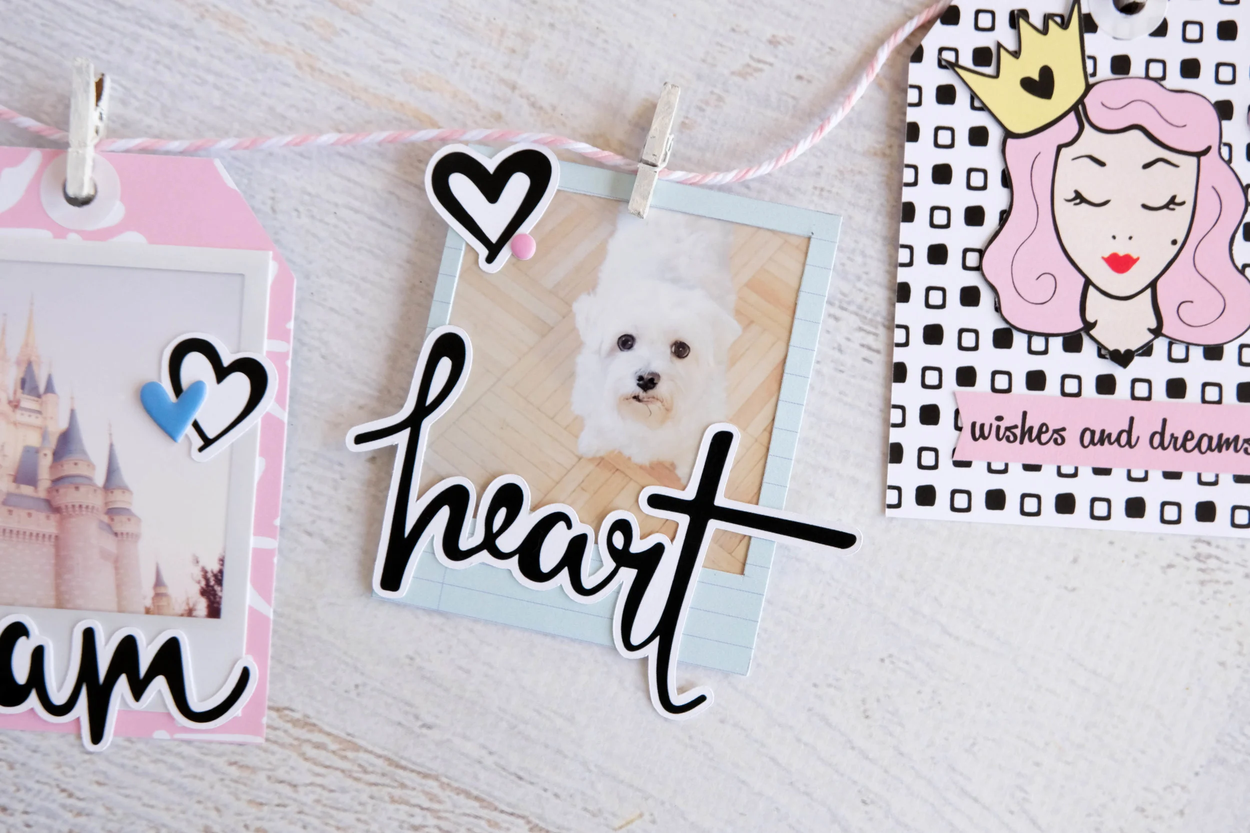
For my second “tag,” I cut out a polaroid frame from one of the papers to frame a photo of my dog Joey. I paired his photo with the word “heart” because I just love him so much and he’s a huge part of my life and my heart. I layered the die cut over the frame the same way I did with the previous tag, so a bit of the word hangs off the edge, then embellished the polaroid with another black and white heart die cut and a pink puffy dot sticker from the Take Note kit. I then hung it on my string with another white painted wood clothesline pin.

I repeated the tag process with this third tag, using this black and white square pattern from one of the planner dividers. Yet, instead of using a photograph, I fussy cut the princess image from one of the other dividers and pasted her in the center of the tag along with the “wishes and dreams” die cut that I cut into a banner. I embellished the tag with another puffy heart sticker, this time in pink.

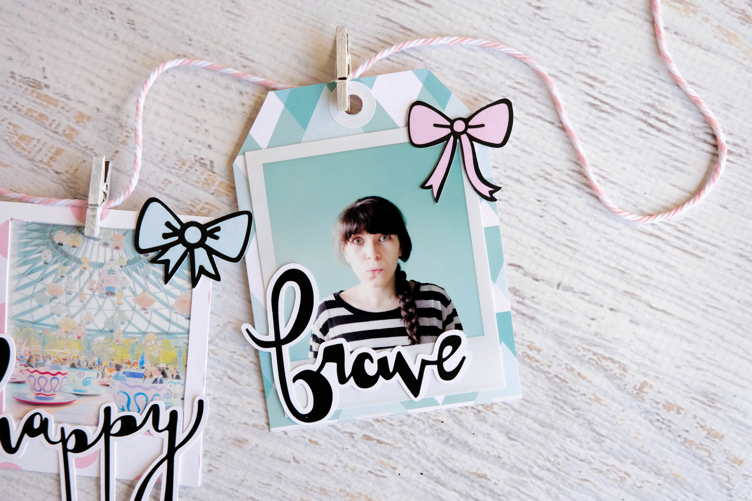
For the fourth tag, I created another polaroid frame using the pink polka dot pattern paper. For this one, I used a photo of the Mad Hatter Tea Cups at Disneyland Paris and matched it with the word “happy.” This is by far one of my favorite rides at any of the Disney parks as it never fails to make me laugh. It is just the happiest ride ever. I wanted my banner to remind me to always be happy, so I thought this was the perfect way. I embellished this frame with one of the powder blue bow die cuts from the kit, so that it balanced out the pink.

I made my last tag the same way I made the first one. I printed a photo of myself with a white polaroid frame around it and paired it with the word “brave.” I always strive to be more brave with my life, so again, this was the perfect reminder of that. Since I cut the tag from this minty blue pattern paper, I ended up embellishing it with a pink bow die cut to bring in a bit of the pink color to the tag. This particular tag is very mint/blue in color, so adding a little touch of pink helped it balance out.

I hope you enjoyed this simple cute little banner and that it inspires you to create your own!

TFC-BANNER-7.jpg